I don’t even know if “second impressions” are a thing, but two weeks ago I wrote about my first impressions of Twitter’s new look for web, so I’m going with second impressions to share my thoughts on Twitter’s new and improved web profile . Sometimes you just have to go with whatever feels sequential.
Best Tweets
The Best Tweets feature is supposed to make your Tweets that receive the most engagement appear slightly larger in your profile feed. In my First Impressions post, I posed a few questions, which I will attempt to answer here.
1. What will the weighting algorithm be for these types of Tweets in terms of engagement metrics?
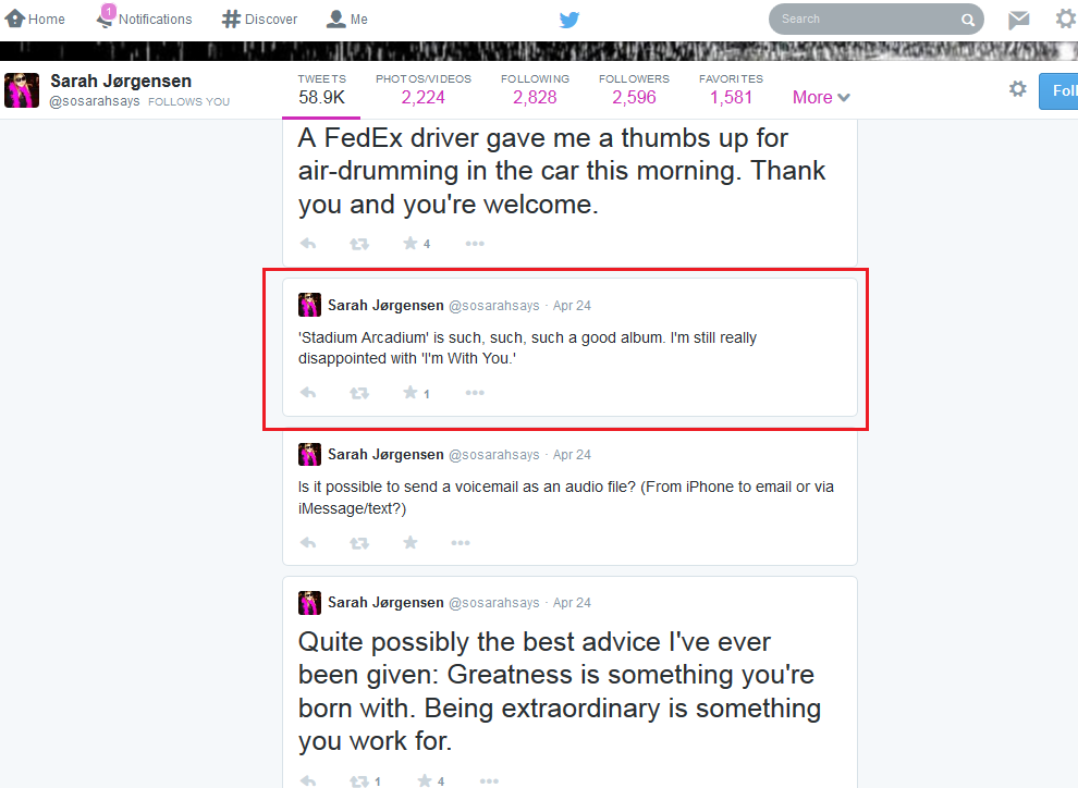
At first, I was worried because it looked like if a Tweet got any engagement at all, it would appear in larger, “bested” font. Here is a screenshot from my personal, profile from yesterday:
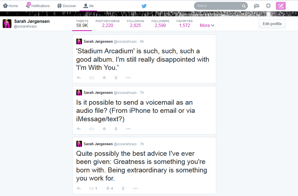
that I didn’t like how this was working. Putting too much content in large, best font on a profile page makes nothing appear special and makes me feel like I need to adjust my monitor. Today, however, I looked at this same content again, and Twitter seems to be adjusting what content is displayed as best based on my profile’s overall engagement. In the image below, note the Stadium Arcadium Tweet with only one instance of engagement is no longer in large font, while the two content items with five instances of engagement each are highlighted as “best.” I am hoping this feature continues to improve on an individual user basis depending on overall engagement on a profile going forward.
2. Will “best” Tweets appear on home feed scroll?
No.
3. Is there a set time frame for Tweets to be included in the larger-displayed, “best” category on your profile page?
Doesn’t seem like it. I scrolled back on my profile to before I switched over to the new Twitter design, and even high engagement posts from back then are highlighted as Best Tweets.
4. Will other people’s Tweets appear “bested” in your feed if they were their best Tweets and you retweet them?
No. But I imagine they might appear as a Best Tweet in your feed if your retweet receives high engagement from your followers.
5. Can you un-best a Tweet without deleting it?
No. I was hoping for this option in the “More” menu for each Tweet, but it does not seem like Twitter has given us the option to manually control highlighting of our best Tweets.
Pinned Tweets
Pinned Tweets allow you to “pin” a Tweet to the top of your profile page. So far, nothing about this feature is surprising me and I think it’s a nice feature to allow brands to draw attention to particular content, like an upcoming event or important message. To answer the questions I posed in my first impressions post:
1. How will impact promoted Tweet earnings, if at all?
Unclear.
2. Will you have to manually pin and un-pin content, or will it fall off of being pinned after a set period of time, like Facebook?
Yes, you have to manually pin and un-pin content. It does not seem like there are time constraints or like pinned content will automatically become unpinned after a set period of time.
3. Will promoted content automatically be pinned?
No. I saw a promoted post in my home feed from Lyft about starting up their ride-share business in St. Louis. This Tweet was NOT the same as the content pinned to the top of the brand’s profile page.
Filtered Tweets
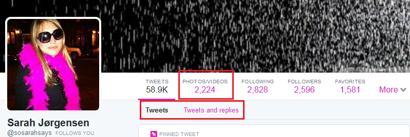
Filtered Tweets will allow users to view other user’s profiles using various filtering options: Tweets, Tweets with photos/videos, or Tweets and replies.
This was the feature I was most excited about, but I have to admit it doesn’t work as well as I hoped. I like being able to filter between Tweets and Tweets and replies, but the Tweets with photos/videos option is odd. First of all, it’s in the new, static tool bar, rather than in line next to the other two filtering options (which are not static with scroll).
Second, if you actually filter by Photos/Videos, Twitter shows them in TWO columns, rather than ONE. From a design standpoint, this feels jarring to me, given Twitter uses a single column design almost everywhere else, including in the “favorites” filter.
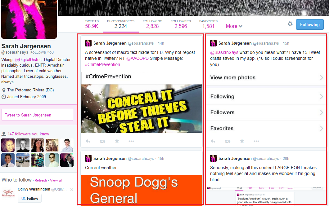
The other places Twitter has moved away from the single-column list are in the Followers and Following sections, where Twitter now displays these users three-across. It kind of reminds me of Pinterest, except all the boxes are uniform in size.
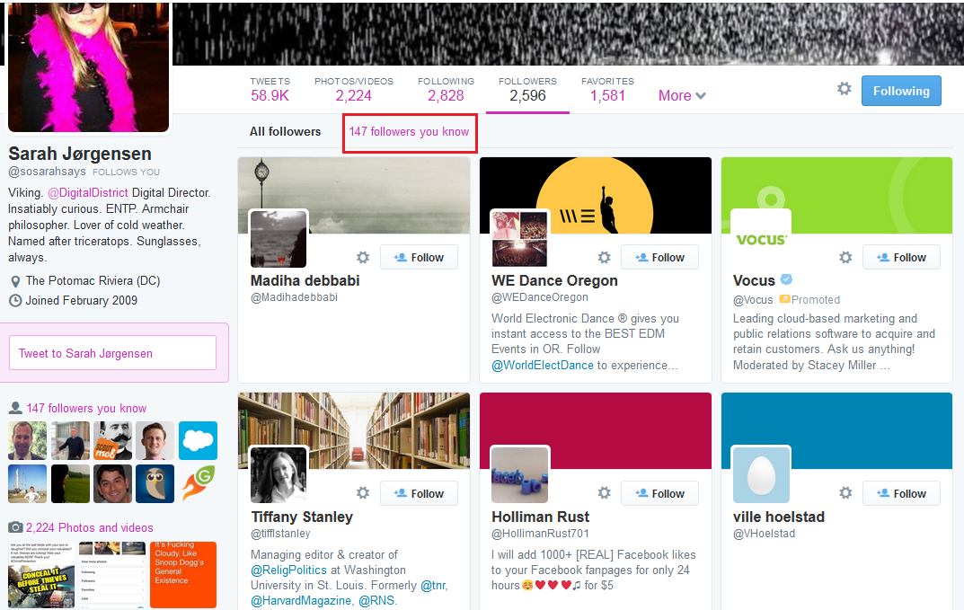
Did you notice the interesting link I red-boxed above, that reads “147 followers you know”? This is kind of a neat feature because it allows you to quickly see how many followed accounts you have in common with another user. follows 147 of the same accounts as I do personally, on This metric is also broken out in the left side bar.
Accounts You Follow
Accounts you have followed are now listed in feed on web scroll. In my first post, I wondered how this feature works. If you have followed more than two accounts recently, does it show the last two, two most influential (as probably ranked by secret algorithm), or something else?
It seems to be the two most recent accounts will be listed side-by-side in web profile scroll.
Other Things I’ve Noticed
The redesign impacts more than web
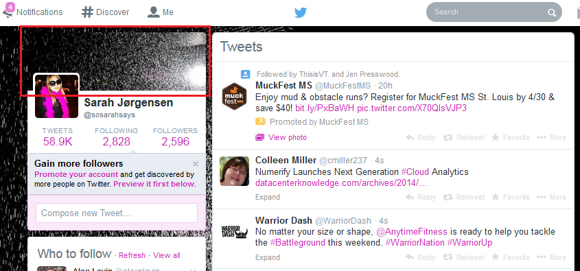
When you change over your account to the new design, keep in mind your new Twitter “cover image” will carry over to a few places. It will appear as your previous header did on your mobile profile, and in your profile box on your home feed page. You’ll have to make sure your cover image works in each area.
So, there you have it. My second impressions of the new Twitter design. What do you think so far? Are you happy with the changes? Share your thoughts with us in the comments below or on Twitter .

